 A long time ago in a startup sort of far away…
 Jell was grown from a hackday project into an full-blown product with a growing user base. The development team at Formstack was working on it as a side project and piecing together the brand and user experience as they went along.After showing promise, Formstack’s leadership decided to dedicate the team to the product and hire a designer (yay!).When I was first brought on, we were completely focused on product improvements: refreshing the user interface, simplifying the user experience, and iterating on the feature set.As Ade shared last week, we were becoming a little wary of our place in the market as Flock. After exploring our options, we knew were going to have to rebrand.
Defining ourselves as a brand
Not too long after I joined the team, we had our first offsite in a little quiet town called Las Vegas. We figured with nothing to do in the city we could jell as a team. (Nailed it!)Our alternative motive for meeting in person was to discuss our long term vision. What did we want to be when we grow up? What did each of us see the company becoming? What did we like (and dislike) about brands in and out of the tech world? This turned into several healthy discussions about our roadmap. We took the opportunity to go through some initial branding exercises.As part of those discussions, Ade and Michael gave me the unabridged history of Formstack. I thought this was important. Formstack is a great company, and in a lot of ways we saw Jell growing to be like Formstack.Conceptually, it was great to see all of us on the same page. We saw ourselves as fun but not silly. Smart but not stiff. We’re all pretty witty but are pretty serious about getting stuff done.Visually, we all liked simple marks. We value simplicity in our product and identity, and identified our brand as falling somewhere in between Slack and Tesla. We all felt our brand marks should reflect the premise of our product in some way. We didn’t want some fancy logo with no connection to our product.When we left Vegas, I felt like I had a pretty good idea of what we were looking for in a primary mark. We later settled on the name Jell. That’s when the real fun started…Defining Objectives
Before I started playing around with potential logos, I had a few objectives in mind:It had to be simple. So simple anyone could draw it on a whiteboard with minimal artistic talent. It had to represent our mission of bringing individuals together as a team. Whether it was obvious or not, I wanted there to be more under the surface. It had to be unanimous. Everyone on the team had to sign off. I didn’t want to do any “selling” of the idea. It was going to be right or we would move on.With those goals in mind, I went to work.Exploring Concepts
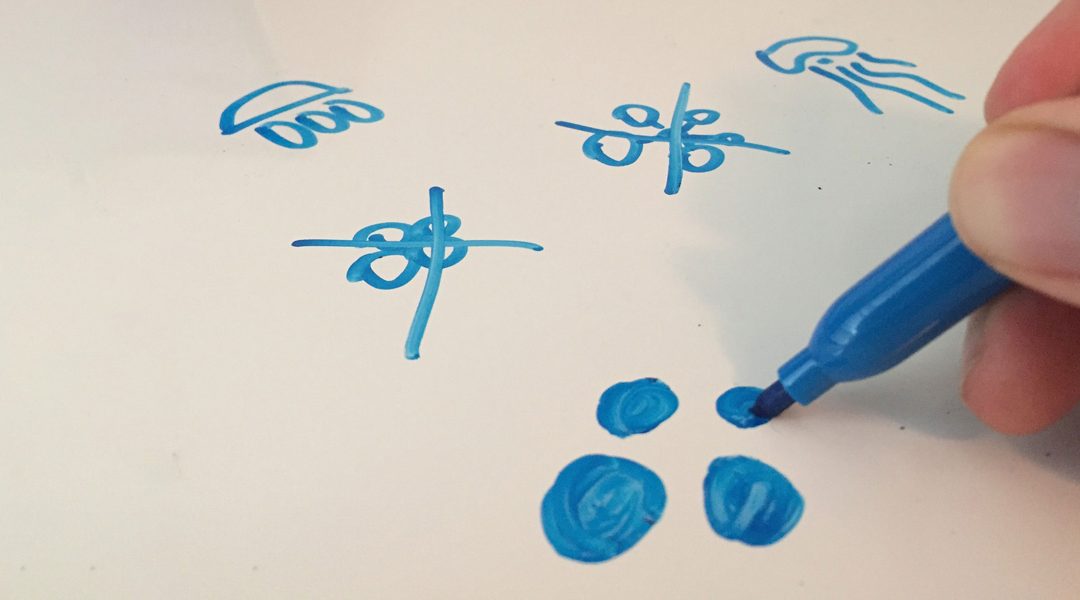
Early in the process, I worked on a whiteboard.Enter the Swarm
One of my early ideas was having a jellyfish as our mark. A jellyfish has a loose network of nerves that essentially acts as its brain… it felt like a good analogy for a team coming together within an organization.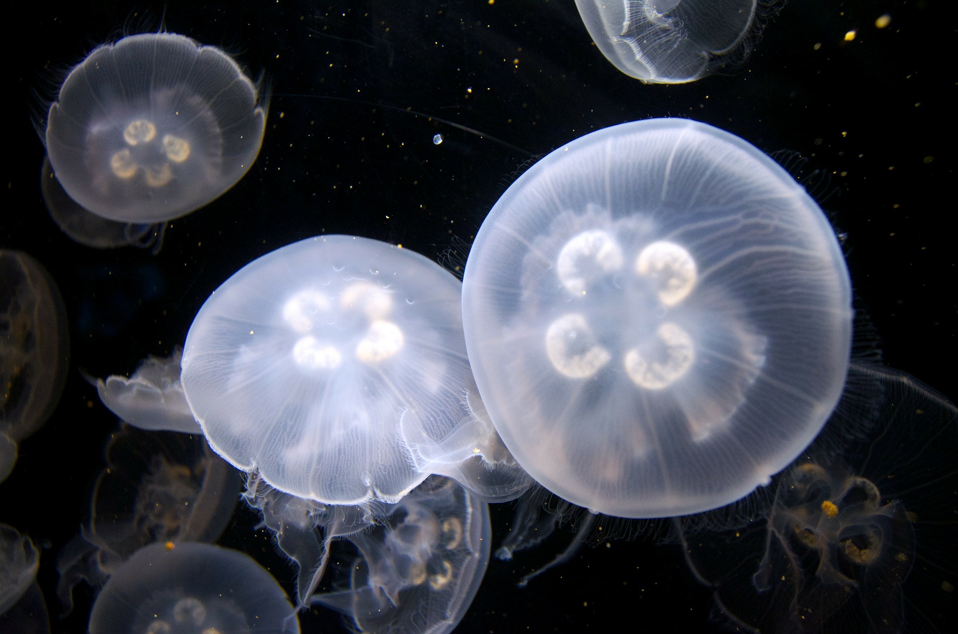 These iterations didn’t make the cut, but it did influence a different idea later in the process.I had the idea of grouping several jellyfish together. With the team concept above, combining multiple jellyfish represented the larger organization.Interesting idea but it could look really complicated.So I started playing around with different perspective views and essentially ended up spinning around a group of jellyfish (aka a swarm) in 3D. It all just looked too complicated… until I looked at it from above.If you look at a group of jellyfish from above, you’ll essentially see circular shapes and outlines. I was able to get the simplicity and meaning I was after.I pitched to the team and our swarm mark was officially born.
Side note: Many of our early feedback from friends and peers drew the connection with the circles being people huddled up. Not quite what I was going for but, hey, that works too. 🙂
Seeing Colors
Now that we had our mark, it was time to play around with colors.The interesting thing was we ended up not changing our brand colors. Before going through the rebranding effort, we expanded our color palette within the app.Through a similar multivoting effort we ended up with a fun (but not outlandish) slightly muted primary brand color (teal), bright accents (orange and blue) for occasional use and supporting colors to ground us.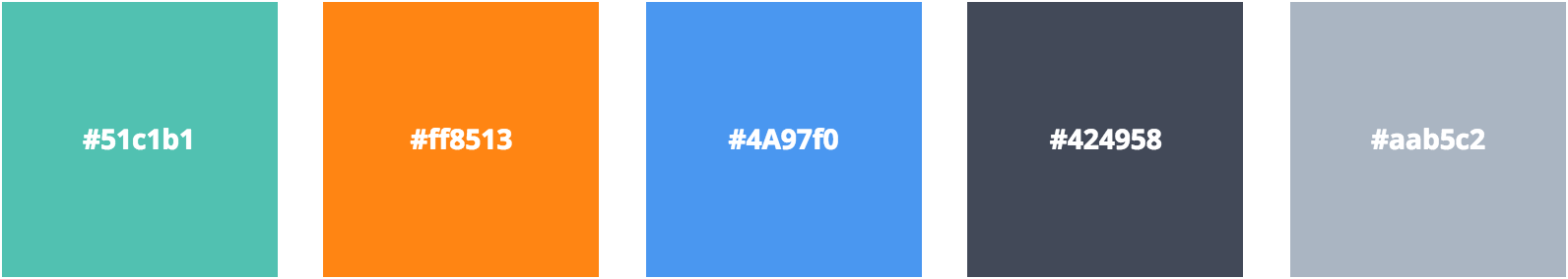 We did explore other options but found our existing colors fit us (and the new logo) well. We weren’t going to change them just for the sake of change.And that’s how we arrived where we are today. Throughout this exercise, we kept the process moving with the help of Slack and Jell—an integration for daily online standups. What do you think of the new look? I’d love to hear your thoughts.